On the occasion of our exhibition Shapes (April 21-May 27, 2021), we spoke with artists Rana Begum, Ethan Cook, Marie Hazard, Sheree Hovsepian, Paul Kremer, Anna Kunz, and Joel Shapiro about their work.
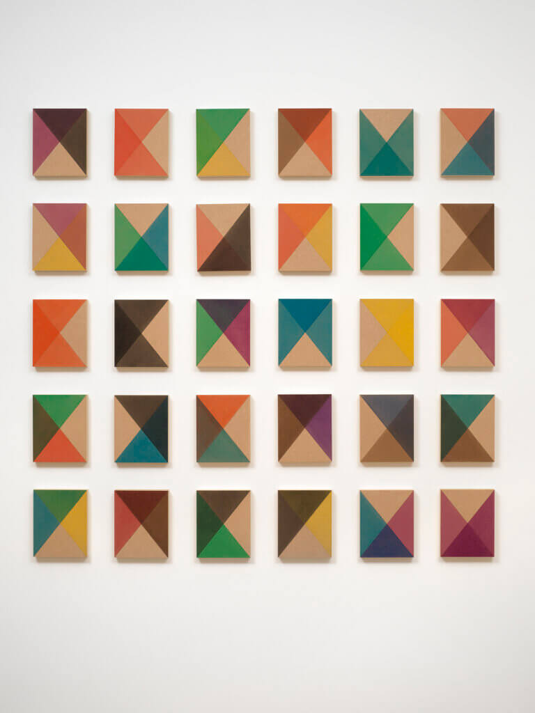
Rana Begum, No. 1057 Painting, 2021, paint on MDF, 65 x 66 7/8 x 1 5/8 in. (165 x 170 x 4 cm.).
London-based artist Rana Begum employs geometry to capture light in her work. When seen in Begum’s unique configuration, the 30 individually painted MDF panels in No. 1057 Painting may resemble a colorful flickering light.
Q: What role does geometry play in your work?
A: It is fundamental to my work. Geometry, order and repetition impose formal limitations on the work and force me to really focus on the relationship between light, color and form and how they interact. I find this feeling of constraint creatively stimulating, challenging me to push my work in different ways and explore what is possible within these geometric parameters.
Q: How do you compose the shapes in your work?
A: The way shapes are formed and layered is determined by the perimeter of the work. This also determines the number of layers that are applied. Recently, I have started to simplify the forms and layers more and more because I love seeing the color interaction between each layer.
When thinking about shape in my work, it is always important to me that the geometry creates a sense of movement and rhythm. Different geometries create different movements, slowing something down or speeding it up. So the shapes are often determined by how I want the work to operate, whether it creates a feeling of movement and flow or whether it is about pausing, halting this movement.
Q: You work in various media including colored glass panels; wicker baskets; marble; and paint on MDF panels, mild steel, or powder-coated aluminum; among others. How does this variety inform your practice?
A: The relationship between the material and the art work is hard to describe. Sometimes an idea comes first, and the challenge is to find a medium that can materialize this idea and give it form. And sometimes, it is a material or object that inspires a work. I can encounter something with a specific form or textural surface that reacts to light in fascinating ways and, from this, a work develops and evolves. I think most of the time it is impossible to tell what comes first, both are essential and interlinked.
My work is very sensory, it is about creating an experience. When thinking about materials, the importance of touch is essential. We are all so drawn towards the sensation of touch. Texture can completely transform a work, both in how it feels, the experience it creates, and how it reacts to movement and light.
Consider the difference between glass and mesh, for example. Both are transparent materials that let light permeate and allow me to layer color. Both offer me a means to explore the effect of transparency and how color, light and form interact. And both offer completely different responses to this inquiry, producing a completely different feel, a completely different experience.
Q: The composition of the 30 individually painted MDF panels in No. 1057 Painting follows the rule of having three congruent painted triangles and one unpainted triangle. Yet, the arrangement of the pieces seemingly rejects any pattern. How do you feel each element relates with one another to form a whole? How do you balance order and disorder in your practice?
A: This tension, between order and disorder, lies at the heart of my practice. While my work may appear to be determined by strict formal parameters, using hard edge geometry, order and repetition, the medium of light introduces a sense of transience and movement, creating a work that is changeable. It is essential that my work is not static and allows for an element of unpredictability.
When creating No.1057, there is a rhythm and order to the process that can feel meditative, allowing me to become completely absorbed in the way the colors are combining and interacting. I apply one color at time across a series of panels, giving the first panel time to dry before applying the next. However, despite this methodical process, the final result is unpredictable. When I first hang the work I try to keep it as random as possible, letting the work evolve without intervention. I am always so excited and surprised at how it all comes together, how the single forms combine to make a whole. When I make the final adjustments, moving panels around almost instinctively, the whole work transforms, embodying a sense of movement within the grid.
In the last year, I have found myself being drawn away from this order and geometry and towards something more undefined, organic and loose. I have started working with nebulous, curved shapes that resist any order or uniformity. This has been a big challenge for me as it requires me to let go and give up some control over the work, letting it grow and evolve into something unpredictable.
Q: How do you determine the color combinations for your paintings?
A: It is important to me that there is a balance between bright, vibrant colors and a calm, meditative experience. With my work, I always try to create this dual experience. The bright colors initially catch your attention, drawing the eye to work. However, as the work is experienced, the colors interact and combine to create a feeling of cohesion, of calm.
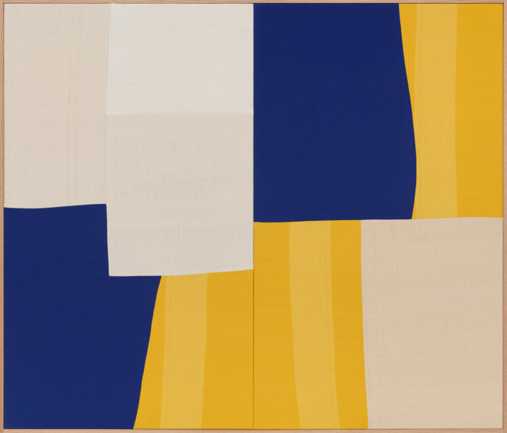
Ethan Cook, Highways and Byways, 2021, hand woven cotton and linen, framed, 60 x 70 in. (152.4 x 177.8 cm.).
Using a four-harness floor loom, Ethan Cook constructs large-scale abstract, minimalist works made from hand-woven canvases. Cook’s vibrant work is composed of pre-dyed cotton, defying conventional painting notions.
Q: What role does geometry play in your work?
A: Geometry is something that just happens in a how-the-world-becomes-world sort of way. You see it on side walks, sides of buildings, cars, even in the stars. When filling a space, geometry is inevitable. The curved lines that are the structure for Highways and Byways start as single semicircles then are cut and multiplied across the field. The Carteian grid becomes entropic then is reinforced by the sharp edges of the stretchers.
Q: How do you compose the shapes in your work?
A: The works are always laid flat then I work with a battery of different canvases before committing to certain ones. It’s a physical process of walking around, sort of stalking and squinting at the colors until they feel right. The works have to be felt, when they feel right I move to the next step.
Q: How do you hope the geometries in your works will relate with the spaces in which they are installed?
A: I make a model of each space and determine the sizes of the works based on the model. The architectonic space of the picture plane should be at an impasse of harmony/disharmony within the larger space.
Q: In your 2021 Highways and Byways, there is repetition of blocks in tan, cream, blue, and striped mustard and pale yellow, yet you manage to create new shapes even within the repetition. And the blue segments seem to refuse a pattern. What roles do chance and order play in the overall composition?
A: Chance is inherent in the weaving process; there are always ‘mistakes’ present. The shapes come together by chance, creating order.
Q: The colored shapes in your woven compositions often deceive viewers who are not familiar with your work into initially thinking that they are painted. Can you share some background about your choice to hand weave your works? What do you hope will be revealed upon close inspection of your woven works?
A: In 2012 when I started weaving, I really wanted to make a painting. I aim to create a space that denies fixity, opening the viewer up to areas beyond the work itself. The movement of the colors, the use of line, and the gestalt versus minute (focal and multifocal) are all opportunities for that transformation.
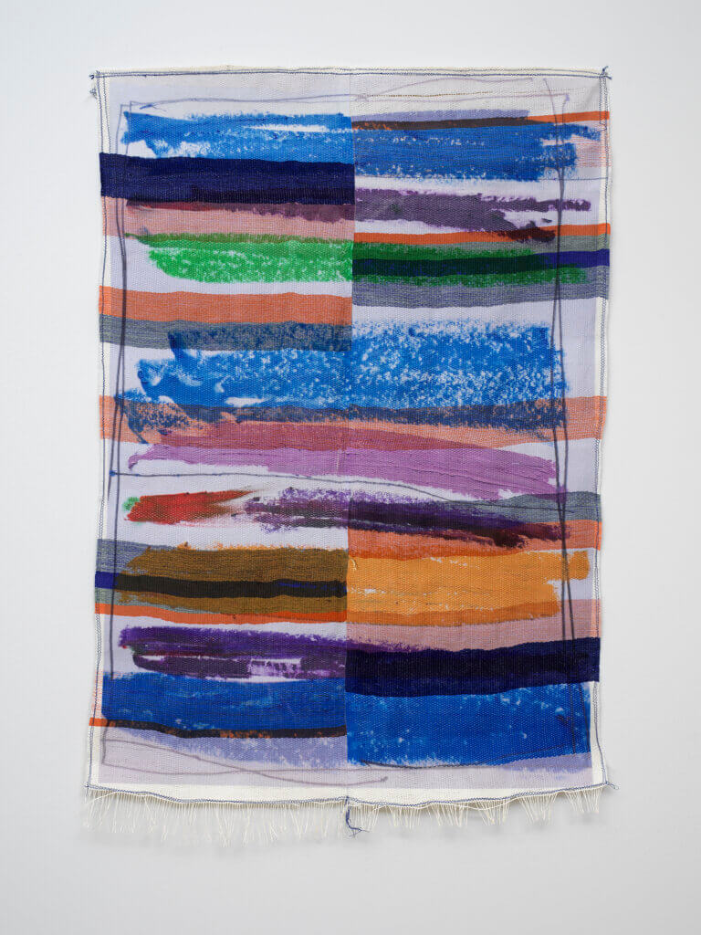
Marie Hazard, in between lines, 2021, hand woven in paper and polyester threads and digital print, 49 1/4 x 33 1/2 in. (125 x 85 cm.).
Marie Hazard hand weaves polyester threads—and sometimes digitally prints on the resulting textile—to be at variance with the rapid speed of industrial consumption, via her long weaving process. Her resulting compositions are comprised of simultaneously structured and loose gestural forms.
Q: What role does geometry play in your work?
A: Geometry plays a big role because of the structure of the loom. Indeed, the loom is itself a framed square to play with. My medium is definitely a limit to building new shapes. I always weave in geometric shapes, always square or rectangle. It is not a tapestry where I am doing a figurative painting; instead, I am making lines or blocks.
Q: How do you compose the shapes in your work?
A: I always start drawing before weaving. The design of my drawing can be an artwork by itself. As a weaver, I am thinking in grids with colored-blocks and lines. I am drawing those shapes with my pastels to see which colors will be on my weave. I also print on top of my weave, with the sublimation technique. This print composes my weave, and creates a different shape. It is a combination between a long and traditional technique (weaving) and an instant digital print (sublimation). The design of my prints breaks the structure of my weave.
Q: How do you hope the geometries in your works will relate with the spaces in which they are installed?
A: It is difficult to reply because I didn’t have the chance to visit in person due to Covid.
Q: Upon close inspection of your work, and of in between lines, in particular, a careful viewer can discern which colors and textures are produced by your woven threads and which result from your digital printing process. Seen from afar, however, the separation is indistinguishable. How do you determine the final, overall composition? Do you have a clear concept when you begin the work, or does it take shape throughout your process?
A: Concerning in between lines, I start from small sketches, planning colors, shapes, compositions, themes, subjects. It is like a mood. Then, I put all the information together and make my selection for this work. I refine. The rectangular shape of my weaves is, by their very nature, the same scale as a standard paper size. It is great to play with the composition, from the paper to the weave and the weave to the paper. I have a base concept, but I allow myself to have spontaneity in the process of my work; I like to discover, adapt and not limit myself. My work is always evolving.
Q: How do you determine the geometries in the lines, ruches, and variation of thread in your off loom hand woven in polyester threads such as Gyō?
A: Regarding my piece Gyō, the geometry is distorted, as it is manipulated by hand through an off loom weave. Yet, it still retains a structure of lines through a structure of threads, and the polyester threads are stitched, tightened together. This piece is a metaphor of my colors pastels drawing. Each color polyester line represents a color pastel mark. It is a mise en abime of my own painting.
Q: You have also described your process of weaving fabric together and then printing fabric on top of your work as “a sort of a mise en abyme”. This repetition highlights the ignorance many have about from where their fabrics originated. What changes do you hope to see in the fabric industry and the public’s general awareness of it?
A: I hope to see a fabric industry where manufacturers are more sustainable and more respectful of the materials. I hope the public will become more aware of what they have in front of them. It is also cultural. In a globalized world, it is easy to source fabrics very quickly and efficiently, but the society in general does not know where the fabric comes from. They don’t know the fabric’s background, the traditions associated with the fabric, the fabric’s creator, and they might not even know what material the fabric is made from.
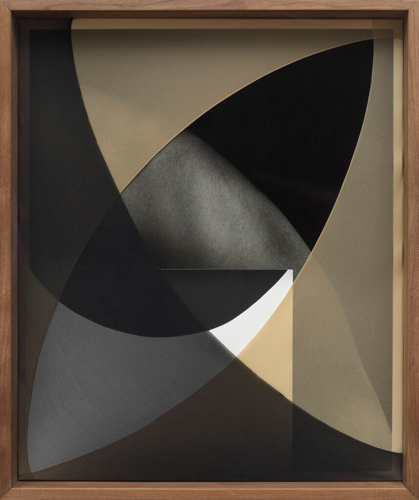
Sheree Hovsepian, Navel Gaze, 2018, silver gelatin photograph and photogram, nylon, artist frame (walnut, optium museum acrylic), 25 x 21 x 4 in. (64 x 53 x 10 cm.).
Coaxed into sculptural forms, layered with tactile materials, and assembled into larger compositions, Sheree Hovsepian’s pictures oscillate between object and image, creating a sensuous, bodily experience of the photographic document.
Q: In Shapes, there are several examples of artists employing the materials they use in their production of geometry to frame the human body. In Ellsworth Kelly’s 1986 Untitled, the wall relief of polished stainless steel reflects the viewer. What does your process of determining the shapes that will frame the body look like?
A: The compositions are a result of play and experiment with the objects and photographs I have in my studio. I am thinking about finishing the form in a kind of exquisite corps way while investigating ideas of my own subjectivity. Photography, especially in the way I am using it, is inherently abstract. Forms are isolated, flattened and taken without peripheral context, and color is translated to grayscale. The geometric shapes are distilled from gestures I use to create form in drawings and in the darkroom while making the photograms. For me, the shapes become an alphabet of limbs and body.
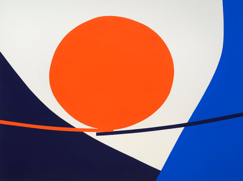
Paul Kremer, Valley Bridge, 2021, acrylic on canvas, 54 x 72 in. (137.2 x 182.9 cm.).
With an exuberant eye for color and form, Paul Kremer paints configurations that may imply architecture or images from nature. Kremer’s compositions fluctuate between formal abstractions and objects left for the viewer’s interpretation.
Q: Many of the shapes and lines in your works appear to extend beyond the canvas, such as the two thin sloping lines on which a vermillion orb floats in your 2021 Valley Bridge. How do you envision your works existing in a space?
A: Unless the painting includes a white border around the edges of the canvas, I always envision the space beyond the canvas. And this imaginary space helps animate the painting.
Q: In Imi Knoebel’s 2017 Element 10.2, the two painted blocks of aluminum meet at a point on the bottom corner of the work, but on the upper-left, the line ends unexpectedly about a centimeter to the right of the corner. Similarly, on the lower-left of your painting Opening 06, the edges of the white and vermillion shapes resist meeting each other at a logical point. Could you share some insight into this decision?
A: This is another way to animate the painting. Logically, the points would meet as the light casts across the wall, but if they don’t meet, it implies that the light hit one surface first, which to me sets the painting in motion instead of it being a snapshot of a moment.
Q: The juxtaposition in the creation of your work between layers on a digital screen and your hand-painted canvas sparks questions about how our digital presence translates into our reality. How do you think about the relationship between forms existing in the digital and the real world?
A: I see it as a back-and-forth relationship… one feeds the other. I am physically creating digital works, by hand, that are then hand-made into physical objects; these are then re-captured to be viewed and shared digitally, before being moved, shown, seen, and kept physically. Someday we won’t have these limitations!
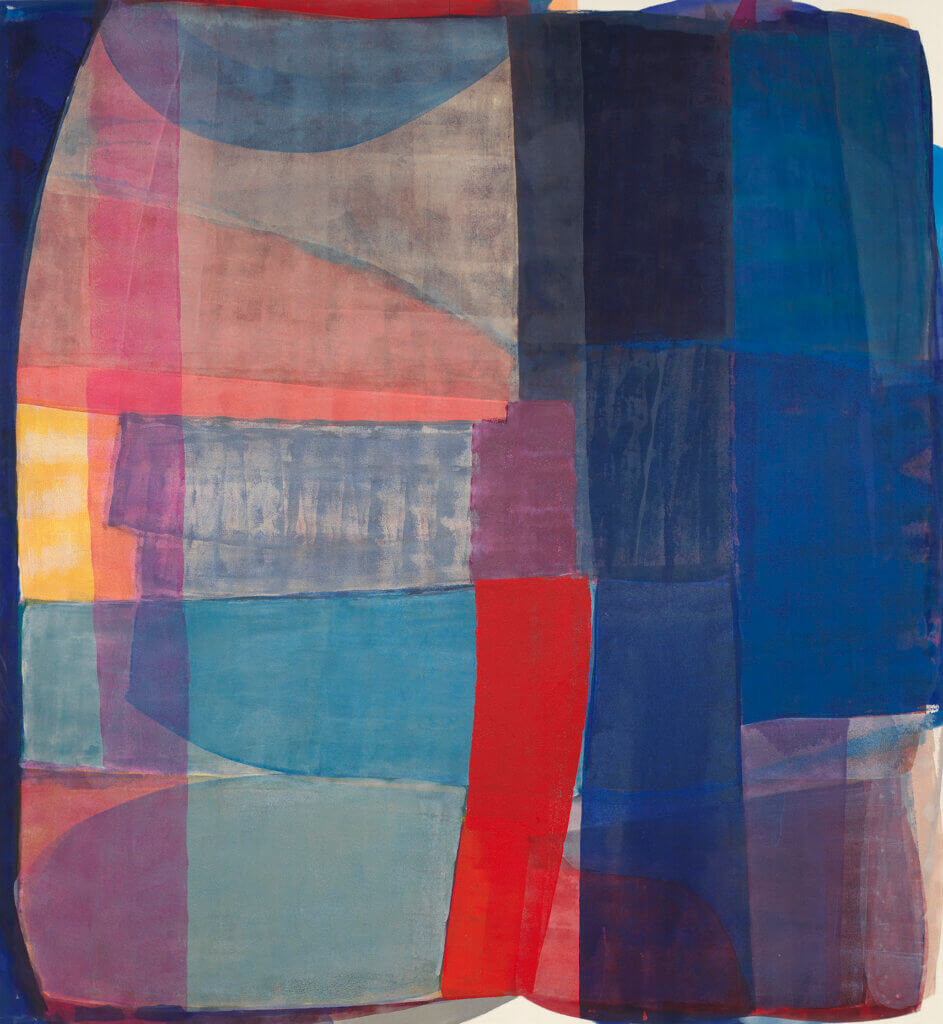
Anna Kunz, The Blue Magnitude, 2021, acrylic on canvas, 78 x 72 in. (198.1 x 182.9 cm.).
With fluctuating color transparencies and geometric shapes, Kunz often creates wave-like optical illusions through her considered and layered pigmentation. The resulting configuration becomes an amalgamation of gestural abstraction and rigid geometric forms.
Q: What role does geometry play in your work?
A: I like the word ‘role” because I think of the geometric forms combined with the color and surface to be performative for the viewer. I depend on the geometry to be a lingua franca. The shapes can create rhythm and rhyme, sensations that are understood and through one’s (viewers/spectators) body.
The Geometric compositions in my paintings are inspired by the rules of geometry found in nature. Color and shapes are layered and stained, creating a kind of ecosystem within the paintings.
Q: How do you compose your work?
A: My work is primarily composed through color and its contingency on light, time, space, and perspective. The colors become bodies leaning into, and supporting each other, the edges of the forms and boundaries are dissolved…. Building what I call “compassionate geometry”.
Q: How do you hope the geometries in your works will relate with the spaces in which they are installed?
A: I hope to make immersive experiences that collapse the distance between viewer and artwork.
The paintings are created in a very active and physical way, I hope they activate the spaces where they are installed. The color is positioned to move and breathe in a surrounding, static space.
Q: How do you decide to title your paintings? Can you share some insight into The Blue Magnitude, Volume and Fracture, and your Demo series?
A: I draw a lot of titles out of poetry, and I enjoy poetic phrases that don’t really explain the paintings but collaborate with them. The Blue Magnitude was titled as such for a few reasons. It concerns the way the brightness of a star is measured, and the thought provided me with enough metaphors to make some paintings for this time of distancing and hope we are living.
Like musicians who make demos, the small paintings demonstrate the interaction of color and form that I want to explore in bigger works. I’m interested in how these oscillations in scale and orientation implicate the viewer in different ways.
Q: Unlike the hard edges seen in Al Held’s paintings, the density of your paint varies within each block of color, producing textures of variegated lines and waves. How do you achieve this texture?
A: Al Held created more evenly composed graphic worlds, but was involved with creating harmony out of chaos for viewers to experience. I can relate to that desire. I use only one or two colors a day, and paint my work on the floor with a variety of tools that I make. The surface color is a result of many, many layers of thin washes of color. Sometimes, I use a light hue as an editor, and build visual textures that way.
Q: Can you tell us about how your gestural brushwork operates within and around the edges of your painted forms?
A: I want the edges of each form to bleed into each other so there are no real contained boundaries. The colors have various vibrations that cultivate optical effects, so my hope is that the paintings are not static, but moving and kind of breathing.
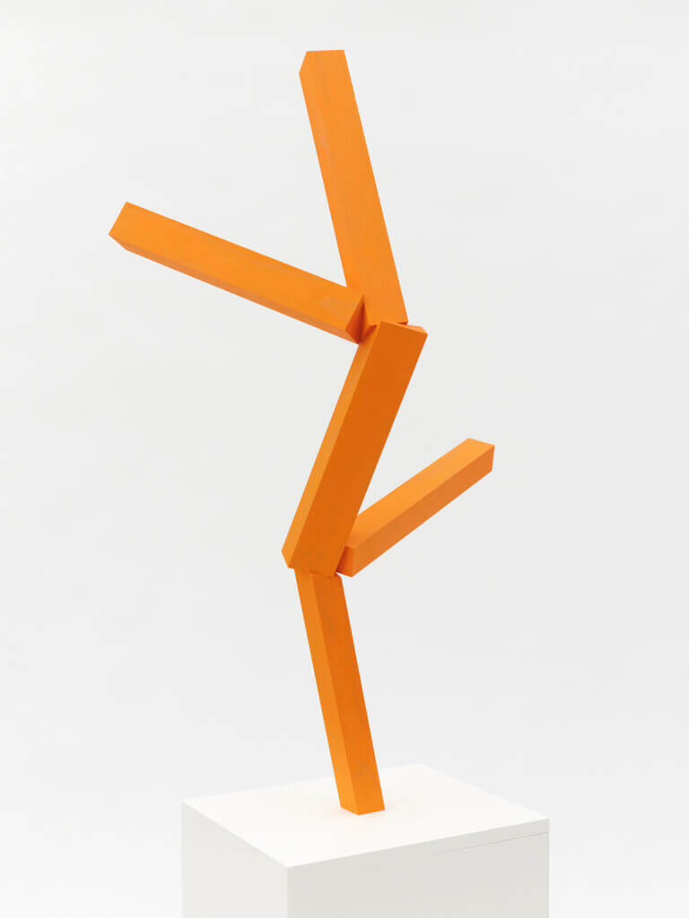
Joel Shapiro, Untitled, 2019, wood and oil paint, 38 3/4 x 23 x 14 1/2 in. (98.4 x 58.7 x 36.8 cm.).
Joel Shapiro’s sculptures incorporate rigid geometric shapes that fluctuate between classical figure representation and abstraction. In the work exhibited in Shapes, the viewer is able to detect the wood grain through the vibrant coat of orange oil paint, inciting questions about Shapiro’s intention and process, as well as the relationship between the human figure and geometric shapes.
Q: What role does geometry play in your work? How do you compose the shapes in your work?
A: The individual components are often recognizable forms — some more unusual than others. I might utilize cut-offs from prior work or cut the work from larger lumber. The process of organization, the relationship of shapes and parts, generates form and that is always a kind of dance between chance and intent.
Q: How do you hope the geometries in your works will relate with the spaces in which they are installed?
A: Well, first of all, I think the form of a sculpture should be determined by something other than the flatness of architectural components—so I try to avoid using the floor, wall or ceiling as a basis for the organization of the form. I’m more interested in how a sculpture might differentiate itself from a space rather than correspond to that space, even if a sculpture might share certain geometric qualities with the architecture.
Q: In the painted wood sculpture included within Shapes, the wood grain is visible through the paint, adding veins and new geometries on the surface. Why do you choose to preserve the texture from the wood in the final sculpture? The vermillion color of this sculpture adds even more exuberance to the already ebullient structure. How did you choose this color? Where does color arise in your process?
A: Lately, I’ve been using marine grade spruce. It’s a strong wood, and the color is neutral. So it plays no real role in determining color. Almost like a blank screen. In this particular work, I used two coats of an extremely deep cadmium yellow. You can emphasize or deny grain depending on the amount of coats. Seeing the grain reinforces the structure. I also did not sand or prime the wood. I usually leave the surface intact once I’ve determined the shape. It retains a sense that it is or was living stuff. Paint can be transformative. It changes how you see material. You can obliterate reference or amplify it. In the end it organizes the form and alters perception.
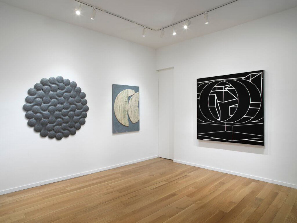
Shapes (April 21-May 27, 2021) at Alexander Berggruen, New York.
Photos: Dario Lasagni.