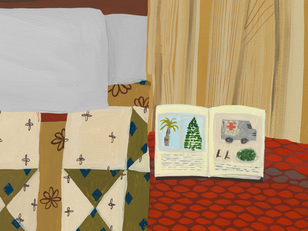
Q: What is the book in Twins about? Does the symbol of an emergency vehicle on one of the pages symbolize something in particular?
A: Symbolic language is inherently fascinating to me because of its economy. It presents a question: what is the least amount of information required to communicate a complicated idea? In this case, I thought it would be interesting to include a visual cue alluding to emergency or disaster in an atmosphere that is supposed to feel cozy or comfortable. Those two conflicting themes don’t feel like they should exist alongside each other, but like most things that are supposed to be opposites, they just live together anyway.
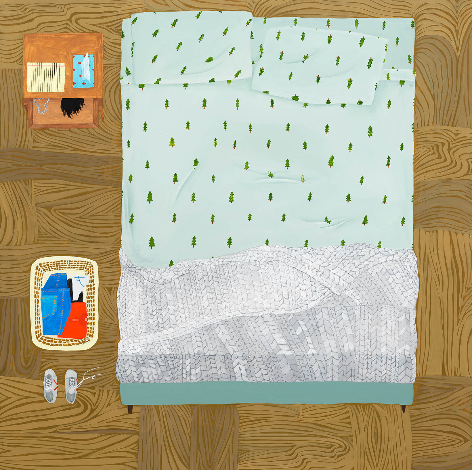
Q: In several of your works, you show clothing laid out on a bed or the floor, often when human figures are absent. How do you see clothing, and in particular in a way in which articles of clothing are meticulously presented, as an emblem of human presence or human behavior?
A: There are so many ways of describing the body without showing it. Clothing is one of those ways, and furniture is another; both of these hold or house the human form. When these things are displayed without the bodies that go in or on them, I think it gives the feeling that some human action has occurred or will occur. It communicates a pause. The absence of figures lets the viewer decide what that action was or will be. I want the spaces in my paintings to feel lived-in while also leaving the narrative of that private life somewhat open-ended…. kind of like I’m starting a sentence, and asking whoever is looking at the painting to finish it.
Q: Do you compose your paintings from real-life imagery, from your mind, or from a mixture of the two?
A: They are mostly composed from my imagination, but certain objects are pulled from memories of past experiences. These details tend to get distorted in a way as I’m painting them–for instance, if I set out to paint a blanket that I remember being on my bed when I was a teenager, the blanket might take on a different color than the blanket that’s in my mind, which is probably a different color than the original real blanket was anyway. Memories, like paintings, are distortions of reality. So I embrace these distortions as I’m working.
Q: How do you feel quilts, blankets, carpets, and furniture upholstery factor into your work? How do you think about their patterns, and how do you think about their imagined textures?
A: To me, quilts, blankets, and beds are strongly tied to ideas of comfort and domestic pleasure, which is an interesting breeding ground (no pun intended) in which to also consider sexual pleasure, something else that can happen in bed. Even the word domestic–especially in regards to femininity–has connotations of modesty, which could be perceived as being at odds with sexuality. In terms of texture, I do want these objects and spaces to feel comfortable, even when the things in them might be uncomfortable to see. The patterns are just another way to explore conflicting or clashing elements existing next to each other, which is ultimately what I’m trying to get at conceptually. Some of the patterns are inspired by real couches or beds or rugs that I’ve owned or seen, but a lot are just made up. They’re all fun to paint.
Anne Buckwalter
Evergreens, 2019
gouache on panel
24 x 24 in. (61 x 61 cm.)
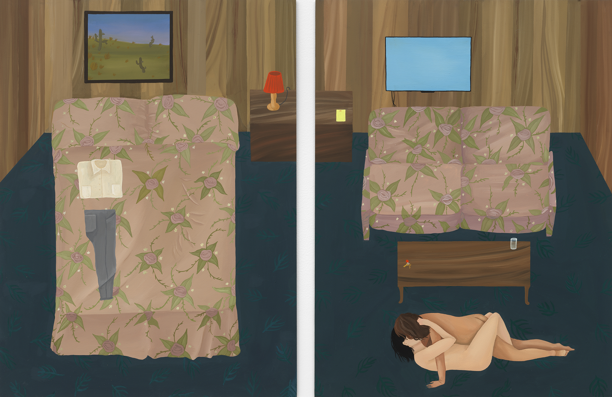
Anne Buckwalter
Amenities, 2020
gouache on panel
overall: 24 x 36 in. (61 x 91.4 cm.)
each: 24 x 18 in. (61 x 45.7 cm.)
Q: In Amenities, what is the painting inside the painting? It is from real-life or did you invent it? Did painting that small passage of this composition bring you outside your normal practice and technique of application for an instant?
A: The painting in there is totally invented. I wanted the room in Amenities to feel like a motel room, so I figured it made sense to put a kind of generic looking landscape on the wall, and then the cactus plants just kind of showed up as I was painting. I think the paint is handled similarly to how I usually work, but subject matter wise, I don’t think I would paint a desert landscape like that right now unless it was hanging on the wall in a room.
Q: Are there two right-foot shoes in Evergreens?
A: That’s funny. They’re not supposed to be two right feet, but I can see it now! I like that interpretation because it makes the narrative a bit more strange.
Q: Why do your works in this exhibition take on an aerial perspective?
A: I think aerial views give an expansive yet removed view of what’s going on in these rooms, and puts the viewer in a position of seeing the details of a scene without necessarily being part of it. If the perspective was more traditional, I think it would be more difficult to achieve that sense of distance. And the distance is important because it balances out the intimate nature of what’s happening in the painting.
Q: In LEP_31 and LEP_36, how do the characters from the cartoon TV show Arthur factor into your work? Why are Arthur and Francine in color in LEP_31, while other figures in the background are rendered in graphite outlines?
A: While animating Redon’s pile of rocks is central to the project, other “scenes” are emergent within that narrative, including architectural ones and ones sampled from existing animations. Arthur emerged from various “stills” appearing in my news feed. The marriage of Mr. Ratburn made headlines and I wanted to reverse engineer the scene based on stills handed to me by the news. I got interested in the way Francine’s head turns in relation to the grooms advancing from one moment to the next. I tend to allow my attention to focus where it will, and deemphasize the parts of a subject I’m not as interested in.
Q: Writer Tim Pierson has noted: “Hodges’ own word for the technical aspect of rendering is: yield. It means simultaneously ‘to stop’ and ‘to produce.’” How does this paradoxical meaning of the word “yield” affect your understanding and maintenance of your artistic practice?
A: I’m constantly stopping as a way to produce because that’s how I end up with the feeling of “finding” something as opposed to composing something. It’s as important as starting and it led to being conscious of the animation metaphor in my work. Beginning the same thing over and over and stopping differently each time led to something like stills or frames in a film.
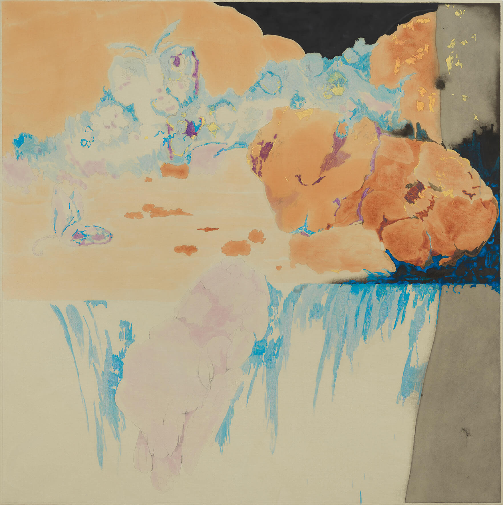
Dustin Hodges
LEP_35, 2020
oil and graphite on linen
60 x 60 in. (152.4 x 152.4 cm.)
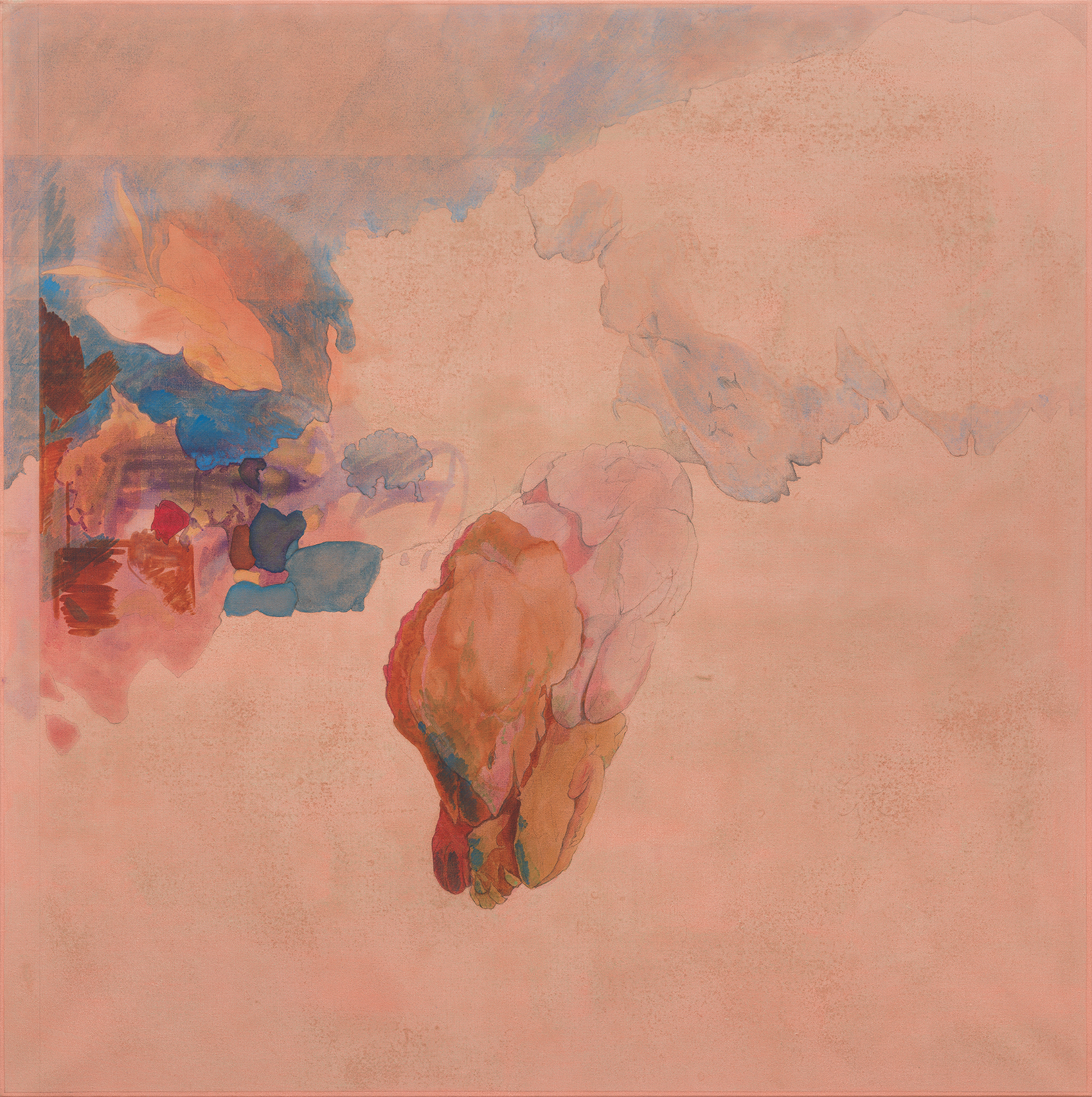
Dustin Hodges
LEP_25, 2018
oil and graphite on linen
60 x 60 in. (152.4 x 152.4 cm.)
Q: In the top left corners of both LEP_25 and LEP_35, there are butterflies or moths appearing ready to fly past the edges of each canvas. What is the significance of the placement of these Lepidoptera?
A: As a rule I try not to think about the significance of placement. The butterflies are sort of ever-present in the series and in these two paintings they actually get rendered. I think of butterflies/moths as the animal kingdom embodiment of the film medium: their physical structure and movement and of course the whole metamorphosing in a cocoon bit.
Q: How do you think about film and film stills in your practice?
A: I think about film as the THE 20th century medium and in my practice it becomes a fiction that I use to rethink medium specificity in relation to painting.
Q: In LEP_35, how do you think about perspective and spatial relationships?
A: LEP_25 and LEP_35 are part of an ongoing movement within the series that has the rock-pile observed from above and in “three quarters” view instead of eye-level and in profile (as in the original painting). LEP_25 has the “camera” moving in relation to the scene. LEP_35 has a phantom rock-pile leaping out of the actual rock-pile the way a cartoon ghost emerges from a corpse.
Q: In Summer Heat Exotic Birds and in Sea Dogs, how do you think about the three vertical vignettes in each painting? How do you decide to represent different times of day and exposures of light within each segment?
A: The triadic paintings started out of a desire to explore color harmony as a generative picture making device; I would select three to four harmonious colors, and apply them as underpainting; the early paintings were sparse, but then the color chords started to suggest a mood, in sort of a synesthetic way. Then imagery followed. After the painting was divided into these color zones, the way in which I should build it felt inevitable. Gradually, I became more adept at using the fractured picture plane as a way of sort of exploding the temporal limitations imposed by the rectangular support; the ‘sections’ can be read sequentially, synchronistically, as incongruous episodes, or simultaneously.
Q: In Sea Dogs, what part of the story do shadows tell? And how did you approach the more painterly composition of plant and tree-like subject matter at lower-right, seemingly reminiscent of your older work?
A: The shadows provide a sort of gestalt for depth, but they are also an opportunity for abstract, formal invention, and sometimes humor. I really enjoy the idea that the shadow doesn’t have to be right to work; shadows behave in strange ways, and nobody is going to question their articulation in the way they might question the verisimilitude of a toaster, or something like this. They are also perfect for filling space without putting anything in it.
About the biomorphic section of Sea Dogs, reminiscent of my older work: It’s a more long term project of mine to fuse disparate painterly styles into one unified composition. Maybe it comes out of a desire to find some common ground between all the artistic modalities I have acquired over my lifetime, but of course I am also aware that one way of working points to the materiality and process of painting, while the other dissolves into illusion.
Q: How do you think about artwork within your paintings? Are some of the paintings within your scenes based on real examples from the art historic canon, and are some invented?
A: They serve multiple purposes; many of the artworks hanging on the walls are versions of paintings I have made before, or want to make. Gradually, I think this will elicit an open invitation to more easily fuse my various painterly approaches. I want to keep making all these different paintings, especially these more minimalist landscapes, but to turn out right, they require a state of mind that I am not always willing to inhabit; I’m often antsy to cannibalize all of the wonderful content at my fingertips, and not always content to make biomorphic or geometric abstraction.
Whenever I put an art historical painting or poster into one of my paintings, it’s done in order to expand the space between the specific and the general, to see what opens up.
")
JJ Manford
New York City Loft with Navajo Rug and Matisse Poster, 2019
oil stick, oil pastel, and flashe on burlap over canvas
60 x 48 in. (152.4 x 121.9 cm.)
")
JJ Manford
Portrait of Moondog, 2019
oil pastel and flashe on burlap over masonite
18 x 12 in. (45.7 x 30.5 cm.)
Q: The subjects and titles of your artworks often reference art history, such as New York City Loft with Navajo Rug and Matisse Poster, among others included in Quarters. How do you decide which objects to place in these rooms? What do you seek to accomplish through this conversation with, or possibly revision of, art history?
A: Again, the interest lies in the zone between the specific and the general; the relative specificity of art historical references and cultural artifacts is like an entry point, which opens out onto a space for projection (I hope, at least). The thinking that goes on in terms of picking what goes with what else in a painting feels inevitable and very specific, and yet it is honestly inexplicable at the same time. I make an enemy of the prescriptive, in many ways. Oftentimes, the choices are driven out of a desire to see what happens…what sort of chemistry can or cannot be created by juxtaposing things from different cultural galaxies, and my own personal history. Sometimes I just find myself very entranced by an object or an image, and I want to almost consume it but of course I cannot, so I paint it.
Q: How do you think about animals existing within your works?
A: The animals provide a sense of vitality to the paintings, in the absence of humans. The cats, in particular, preside over domestic scenes as sort of omniscient narrators, or guardians of the threshold between surface and illusion. It’s their territory. Sometimes they are simply there for scale, and they almost always feel welcome to the picture (in a way that humans do not). Humans in my paintings often tend to suffocate the space with their personalities, but they do appear or are implied in the paintings, too, mostly as disembodied shadows or smoldering cigarettes.
Q: Who is Moondog (the subject of Portrait of Moondog), and who does he represent to you?
A: I cannot totally explain it, but he is the sort of figure that I am easily enamored with, largely because I perceive him to have such a mythological ethos and kindness; he could be the human manifestation of art and inspiration, perhaps. He was a blind poet and musicians who lived in NYC, the 40s through the 70s. He was called the Viking of 6th Avenue, and he would dress as a viking and busk and sell his music. He made so much heart wrenchingly beautiful music, much of which was recorded, both vocal and instrumental. He was a real visionary, and there is an unaffected devotional spirit that I think really comes through in his music and poetry.
Q: Your artwork often displays windows, screens, and paintings, seemingly capable of transporting a viewer into another world. How do the subjects within these frames differ from the subjects outside of them? Are these framing devices related to the ways in which technology causes us to experience more of the world through screens?
A: I cannot help but think that technology informs the way in which I think and construct paintings, but mostly I am thinking about ways to refute the flatness of geometric abstraction, and to create more complex narratives. The large paintings, especially, take up a lot of real estate, and it feels wasteful for me to confine the paintings to the shallow space implied by their construction. It feels stuffy. Why not open them up and let some air in?
Brittney Leeanne Williams
Naomi and Ruth: A Tension, A Mirroring, 2020
oil on canvas
30 x 45 in. (76.2 x 114.3 cm.)
Q: In many of your paintings, there is a recognizable figure. However, in Naomi and Ruth: A Tension, A Mirroring, this figure seems to morph beyond recognition, as though undergoing mitosis. How do you feel your use of the figure is evolving in your practice?
A: The figures are becoming more active than in my previous work–they are melding, snapping, breaking, curling into one another. I’m always pursuing a precise contortion or postured figure that expresses an unseen psychological state. I see these twisted and knotted forms as holding an emotional landscape, while being situated in one. Lately, I’ve been thinking a lot about the idea of my paintings having a sound. The twisting, pulling, and bending of figures and the voice those actions suggest. I’m thinking about mothers birthing daughters, which daughters then birth mothers, hence my interest in mitosis, where one cell splits into what are called “daughter cells.”

Brittney Leeanne Williams
Detail of The Bridge From Garden to Desert, 2020
oil on canvas
49 1/2 x 40 in. (125.7 x 101.6 cm.)

Brittney Leeanne Williams
The Bridge From Garden to Desert, 2020
oil on canvas
49 1/2 x 40 in. (125.7 x 101.6 cm.)
Q: What is the significance of lemons within The Bridge From Garden to Desert?
A: Lemons have been a motif in my work for the past couple of years, but have been a long standing presence in my life. My grandmother had an extensive garden in Pasadena California when I was growing up, which included a large lemon tree. She often made both sun tea and lemonade as we were growing up and I associate the zesty smell with her garden. The lemons mark a place and time for me. They mark a psychological state, a time of emotional and even physical fruitfulness. But in addition to my personal symbolism around lemons in my work, the citrusy fruit holds communal associations as well. Lemons ring of California, they are the precarious fruit that are sour rather than sweet and act as a natural remedy.
Q: Do you feel that the human form can sometimes act as a barrier or bridge between two separate environments or physical spaces within your work?
A: I think of the body as an opening, a window, a portal and yes, even a bridge, but rarely a barrier. The contorted pose, or bent back is intended to evoke the woman’s misshaped experience. A woman bends in tiredness, bends to pick up a child, bends to curl into herself for relief, bends to carry, bends to bridge her community, bends in intercession or prayer, etc. In this contorted pose, I think of her straddling multiple spaces. That perhaps her body creates the architectural framework for the portal of the emotional landscape she carries within.
To learn more about Quarters: Anne Buckwalter, Dustin Hodges, JJ Manford, Brittney Leeanne Williams, view the exhibition page here: https://alexanderberggruen.com/exhibitions/quarters/.
Quarters: Anne Buckwalter, Dustin Hodges, JJ Manford, Brittney Leeanne Williams ran at Alexander Berggruen (1018 Madison Avenue, Floor 3) from March 18-May 27, 2020. The exhibition’s preview is available upon request. For all inquiries, please feel free to contact the gallery at info@alexanderberggruen.com.
The First Edition of the Quarters catalogue, which includes the complete interviews with each of the four artists in this exhibition, is available for purchase here: https://alexanderberggruen.com/product/quarters-catalogue/.